

Sprint 8 Redesign
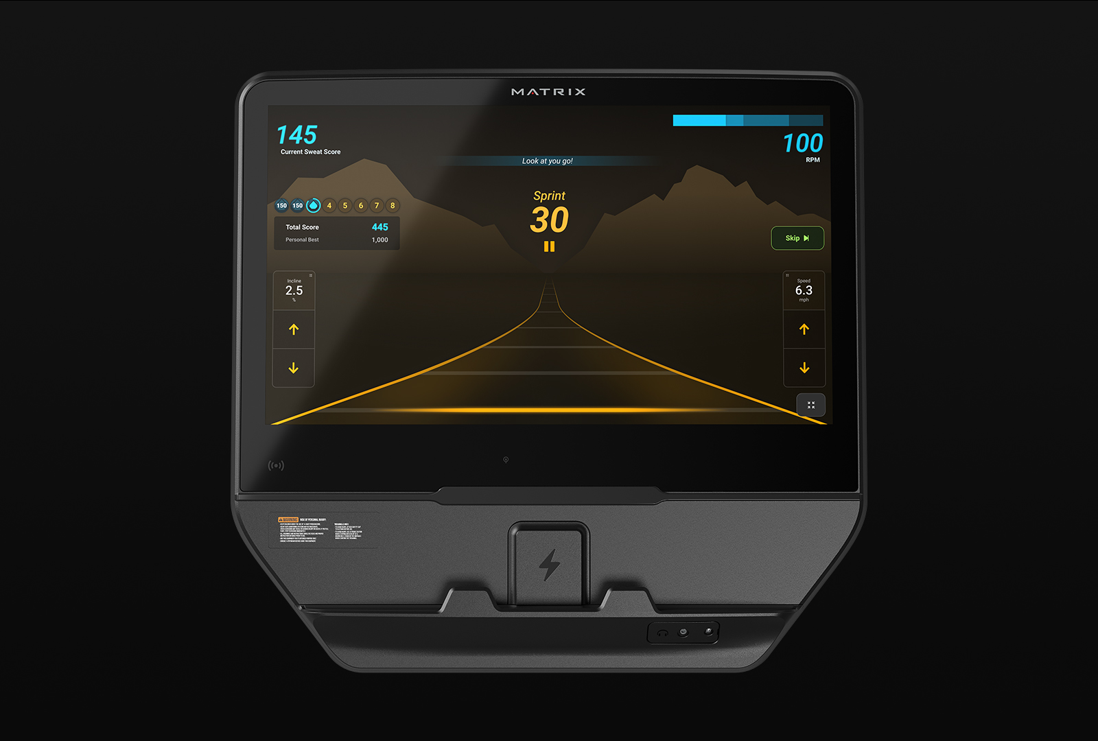
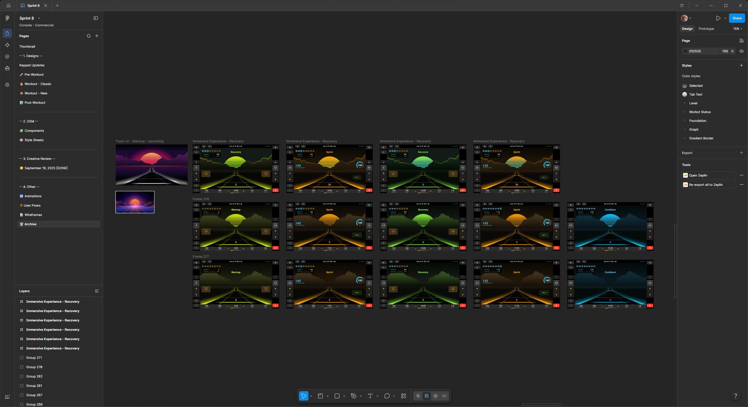
Johnson Health Tech’s Sprint 8 workout was redesigned to become a more immersive and engaging experience. As JHT’s lead UX designer, I had full control over the design process, from concept to animated prototype.
Client
Matrix Fitness
(Johnson Health Tech)
Role
Lead UX Designer
Year
2025

Background
Sprint 8 is in the top 3 most-used programs on Matrix’s cardio equipment. It doesn’t matter if you are using an 8,000 or 8.3 million pixel-density display, Phil Campbell’s program is used on that product. This is a great feat, but also leads into the problem at hand.
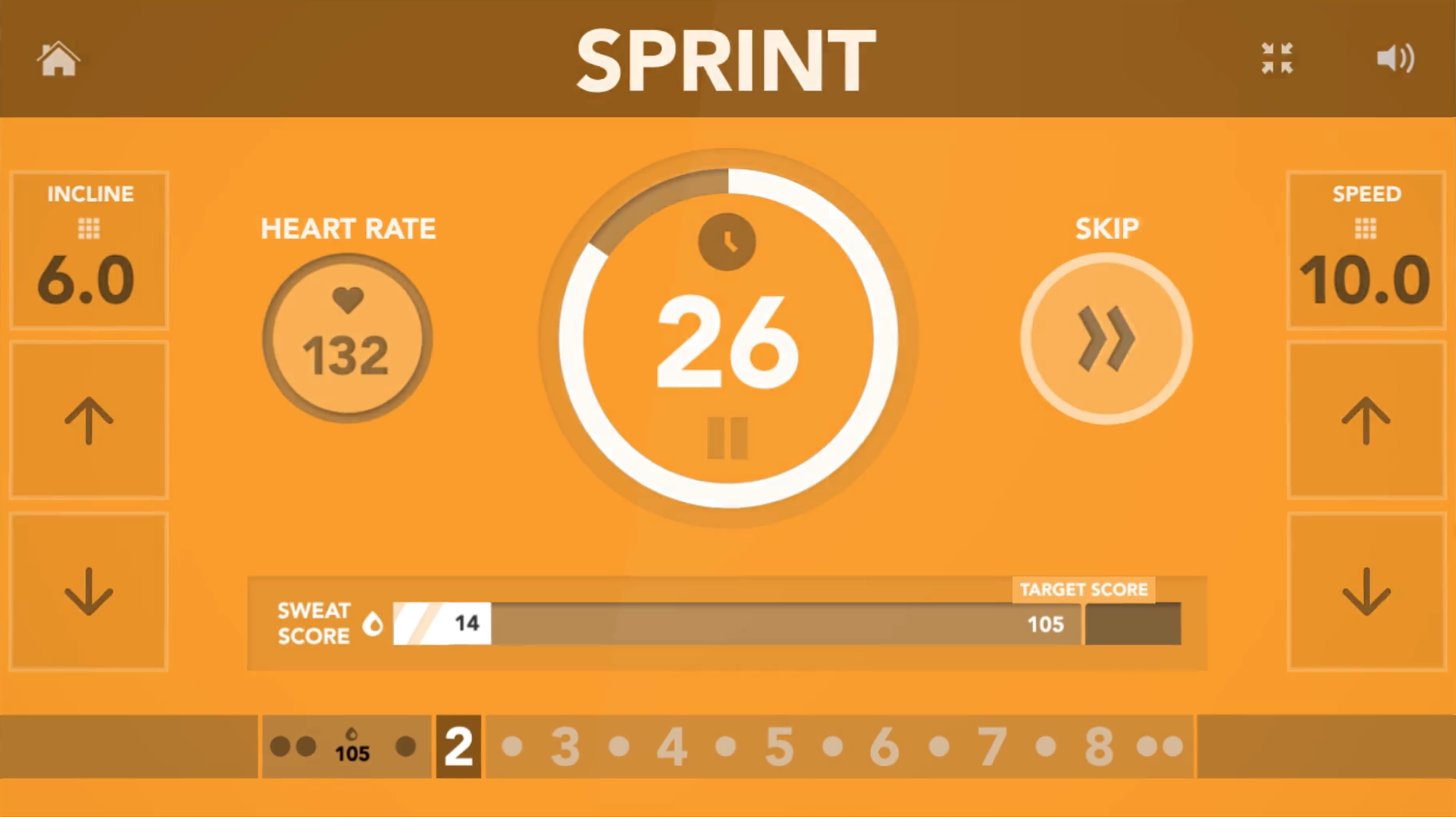
Upon release, the Sprint 8 program was designed with simplicity in mind. The person exercising would sprint for thirty seconds, they watch as that time counts down and their [sweat] score counts up. They rest for 1.5 minutes and then repeat this interval 7 more times.
Ultimately, this could be accomplished with only two loading bar graphics… which is essentially what was previously designed. That simple design helped push the program onto all Matrix Fitness touchscreen interfaces, as well as the PLED (a charming 16-bit inspired console).
The Problem...
There is an overarching problem/difficulty when it comes to digital experiences on indoor cardio machines… engagement. In the field of UX design, this is a certified, “well... yeah DUH,” moment. Although, this type of engagement problem is a very different one than you might see across other kinds of products.
There is one major competitor to stationary cardio equipment as a whole, and the hardest part is that this competitor solves our engagement problem with ease… That competitor is of course the classic, Going Outside™. ️
Across all of my user interviews and usability testing, here at Johnson Health Tech, the hardest persona to please is the outdoor cardio exerciser. They open up their door, start an ‘outdoor run’ workout on their smart watch (optional) and just GO. There is this beautiful experience described to me by these specific users, in which I can only call it some sort of time paradox.
Due to the constant stimulation from being outdoors during a workout, the time in which it takes them to accomplish a Herculean feat of running 2+ miles seems shorter to them mentally than it actually is. When we have those same users testing inside, on our machines, that is when they come to terms with just how long the passage of time really is. They quick-start a workout and then stare out the window of the JHT showroom, not selecting/changing anything on the touchscreen interface and comment about how long 30 seconds really can be.
No amount of infographics, loading bars or timers will make this product enter that time paradox described earlier, which leads this sizable user-base writing off our product as boring. Stakeholders requested for Sprint 8 to become more immersive through a forward motion experience and gamification.
Gamification
I am a big fan of gamification in certain contexts, exercising being one of them. In fact, during my first year within the company I helped push for more program ‘uniqueness’ and applying ‘gamification’ traits, both of which can be seen within the 5k program, Matrix Method.
Exercising, to most people, is a similar experience to learning. They might find that trying to achieve a larger goal (like running a 5k or learning another language) may seem like a daunting endeavor, but as long as they have the tools & can stick to a routine, then they will see improvements in that area over time.
From my own personal background of sports and bodybuilding, the #1 killer of GAINZ has always been a lack of motivation brought upon by a failure to fully engage with my workouts. I want to see myself improving, but I also want to have fun doing it.
Discovery
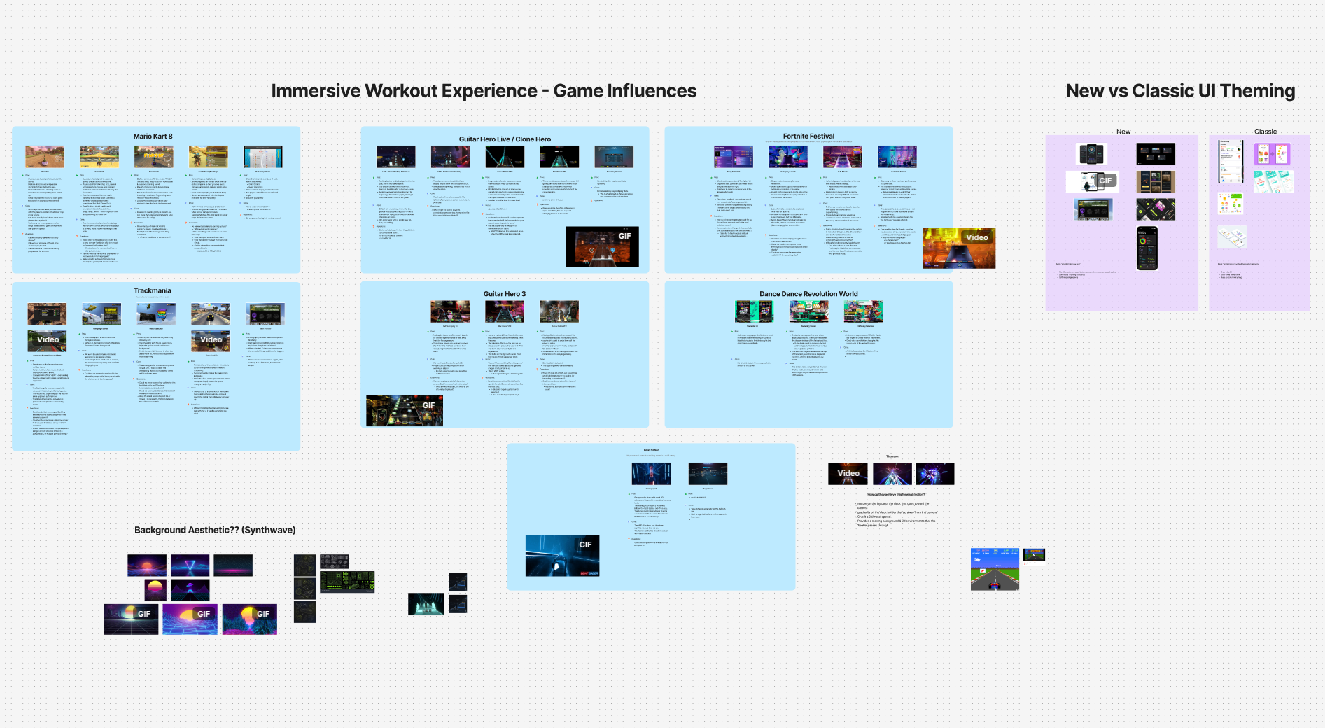
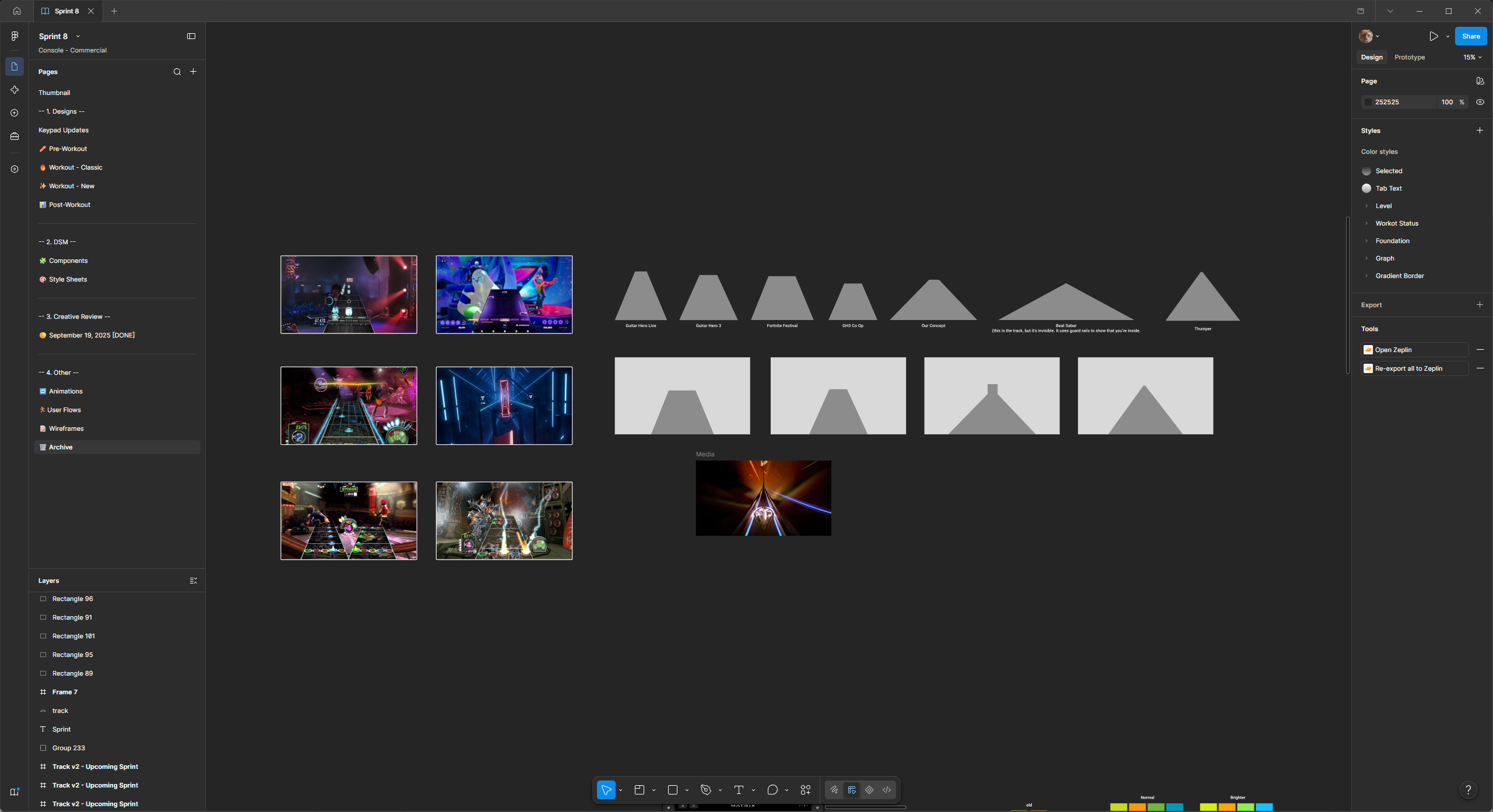
After further discussions with stakeholders and Sprint 8 users, my above assumptions had been validated. Next step was to familiarize myself with different video games that represented forward motion and their associated GUIs.
Design
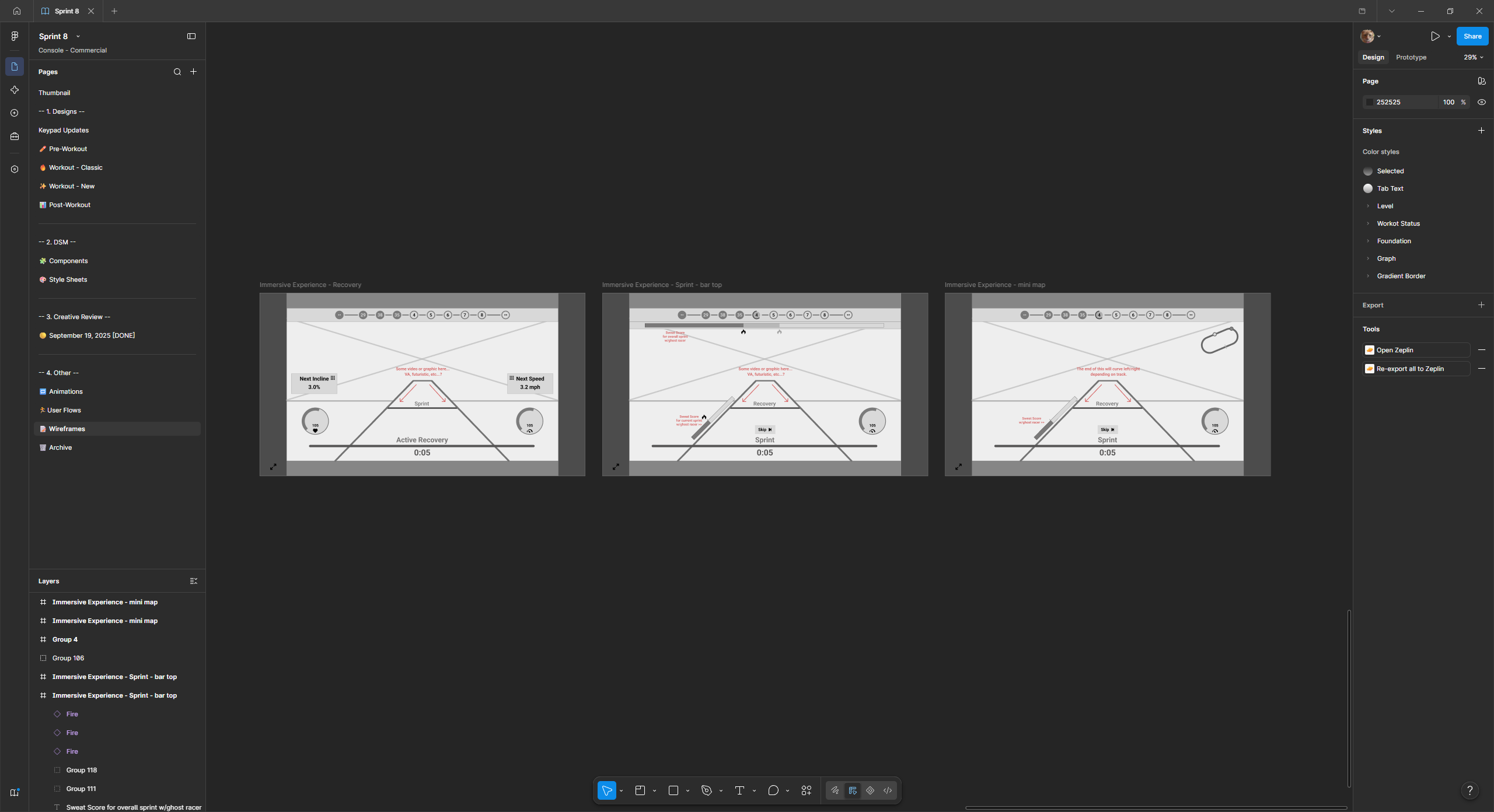
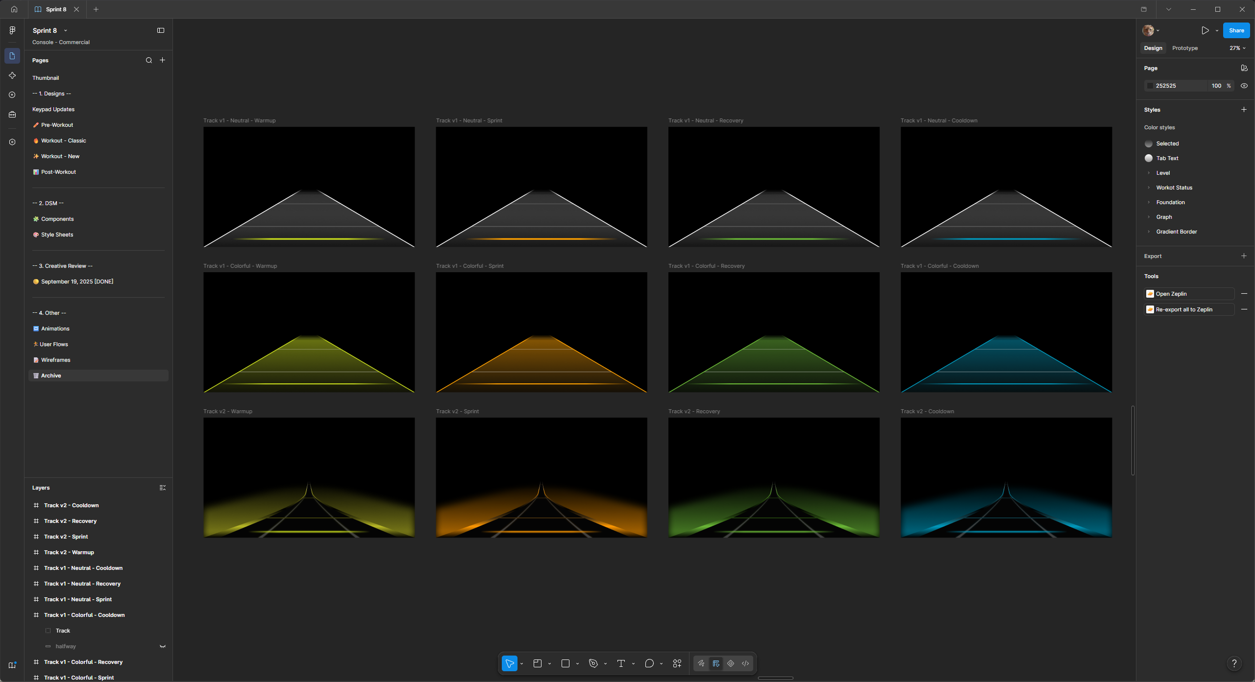
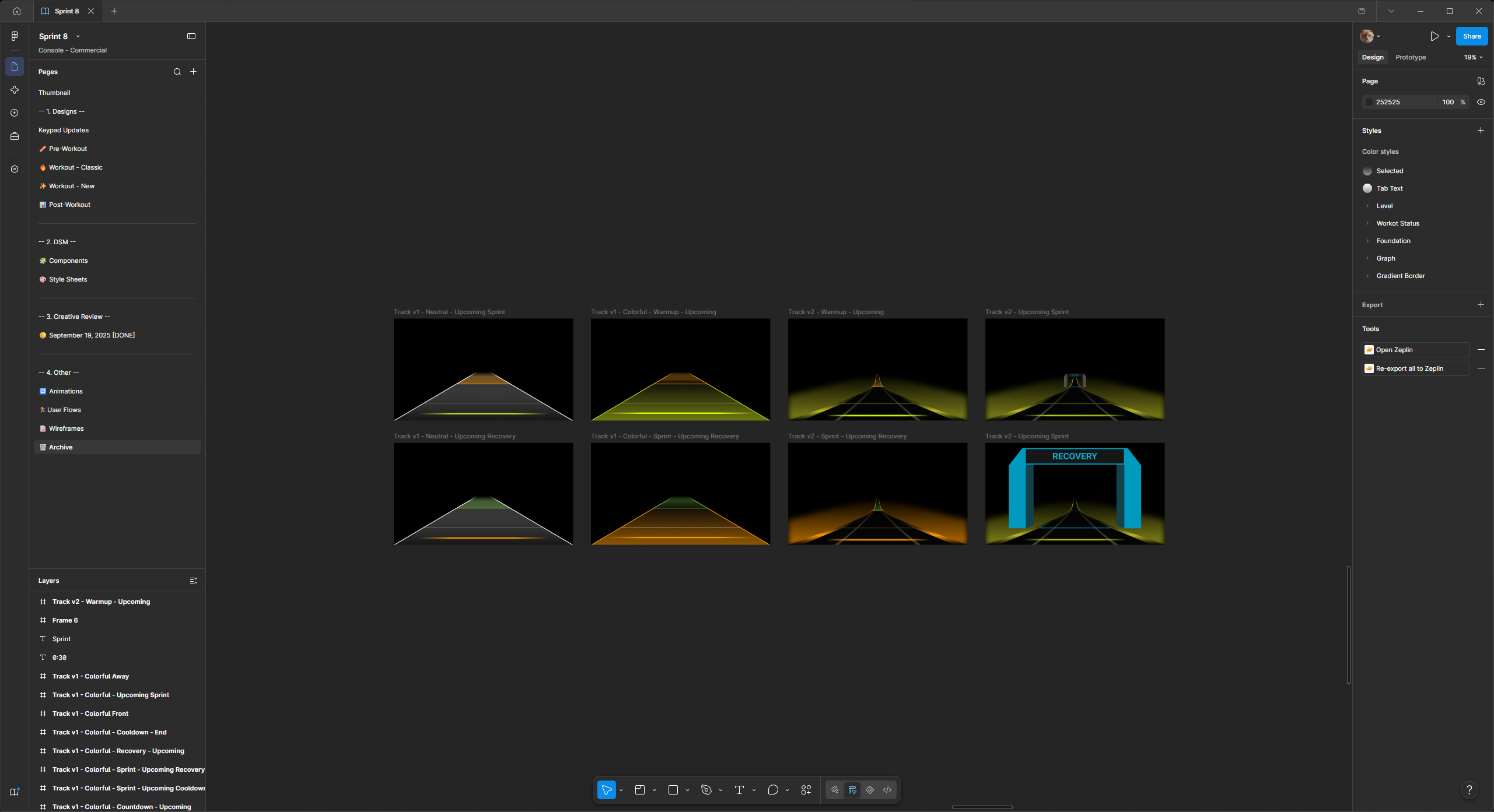
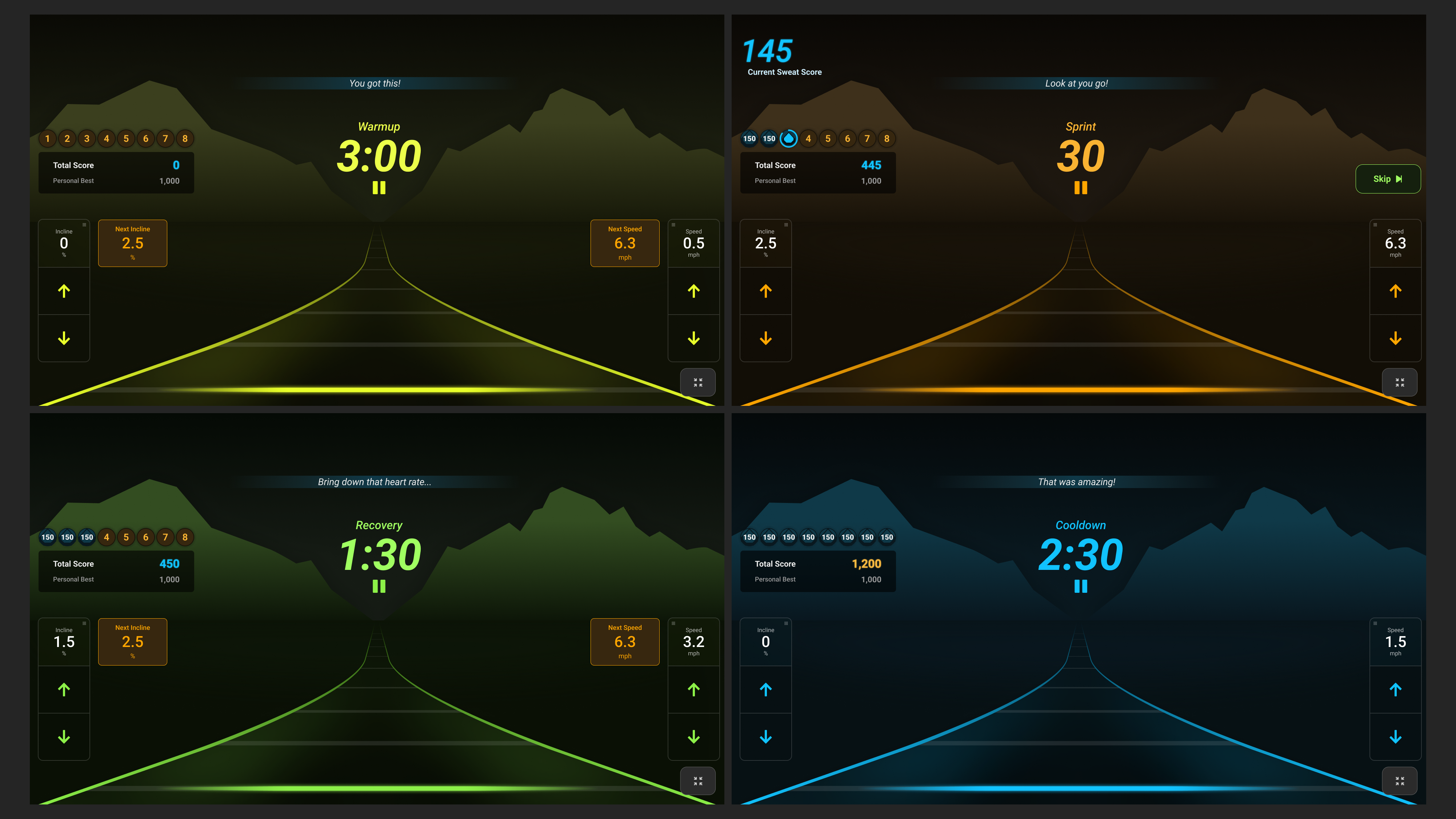
Due to time and resource limitations, I needed a simplistic approach to forward movement that could be animated to show stakeholders, developers and engineers. This only helped narrow down the style I’d end up going forward with.
Next Steps...
This project was a true joy to research and design. I’ve always had a passion for fitness and video game interfaces so this was such an exciting experience. For next time, I wish to have spent more time designing/animating the elements in a more suited program, like Blender or After Effects, instead of Figma.
[2026 UPDATE] The new Sprint 8 designs were implemented so I could move forward with usability testing. When testing users (from beginner to advance) we have found that many participants naturally stated how much shorter a Sprint 8 workout felt with this interface. We received comments about it being more exciting; validating what we originally set out to achieve.
NEXT PROJECT
Matrix Method

·
Resume

WORK
RESUME
Sprint 8 Redesign
Johnson Health Tech’s Sprint 8 workout was redesigned to become a more immersive and engaging experience. As JHT’s lead UX designer, I had full control over the design process, from concept to animated prototype.
Client
Matrix Fitness (Johnson Health Tech)
Role
Lead UX Designer
Year
2025
Background
Sprint 8 is in the top 3 most-used programs on Matrix’s cardio equipment. It doesn’t matter if you are using an 8,000 or 8.3 million pixel-density display, Phil Campbell’s program is used on that product. This is a great feat, but also leads into the problem at hand.
Upon release, the Sprint 8 program was designed with simplicity in mind. The person exercising would sprint for thirty seconds, they watch as that time counts down and their [sweat] score counts up. They rest for 1.5 minutes and then repeat this interval 7 more times.
Ultimately, this could be accomplished with only two loading bar graphics… which is essentially what was previously designed. That simple design helped push the program onto all Matrix Fitness touchscreen interfaces, as well as the PLED (a charming 16-bit inspired console).
The Problem...
There is an overarching problem/difficulty when it comes to digital experiences on indoor cardio machines… engagement. In the field of UX design, this is a certified, “well... yeah DUH,” moment. Although, this type of engagement problem is a very different one than you might see across other kinds of products.
There is one major competitor to stationary cardio equipment as a whole, and the hardest part is that this competitor solves our engagement problem with ease… That competitor is of course the classic, Going Outside™. ️
Across all of my user interviews and usability testing, here at Johnson Health Tech, the hardest persona to please is the outdoor cardio exerciser. They open up their door, start an ‘outdoor run’ workout on their smart watch (optional) and just GO. There is this beautiful experience described to me by these specific users, in which I can only call it some sort of time paradox.
Due to the constant stimulation from being outdoors during a workout, the time in which it takes them to accomplish a Herculean feat of running 2+ miles seems shorter to them mentally than it actually is. When we have those same users testing inside, on our machines, that is when they come to terms with just how long the passage of time really is. They quick-start a workout and then stare out the window of the JHT showroom, not selecting/changing anything on the touchscreen interface and comment about how long 30 seconds really can be.
No amount of infographics, loading bars or timers will make this product enter that time paradox described earlier, which leads this sizable user-base writing off our product as boring. Stakeholders requested for Sprint 8 to become more immersive through a forward motion experience and gamification.
Gamification
I am a big fan of gamification in certain contexts, exercising being one of them. In fact, during my first year within the company I helped push for more program ‘uniqueness’ and applying ‘gamification’ traits, both of which can be seen within the 5k program, Matrix Method.
Exercising, to most people, is a similar experience to learning. They might find that trying to achieve a larger goal (like running a 5k or learning another language) may seem like a daunting endeavor, but as long as they have the tools & can stick to a routine, then they will see improvements in that area over time.
From my own personal background of sports and bodybuilding, the #1 killer of GAINZ has always been a lack of motivation brought upon by a failure to fully engage with my workouts. I want to see myself improving, but I also want to have fun doing it.
Discovery
After further discussions with stakeholders and Sprint 8 users, my above assumptions had been validated. Next step was to familiarize myself with different video games that represented forward motion and their associated GUIs.
Design
Due to time and resource limitations, I needed a simplistic approach to forward movement that could be animated to show stakeholders, developers and engineers. This only helped narrow down the style I’d end up going forward with.
Next Steps...
This project was a true joy to research and design. I’ve always had a passion for fitness and video game interfaces so this was such an exciting experience. For next time, I wish to have spent more time designing/animating the elements in a more suited program, like Blender or After Effects, instead of Figma.
[2026 UPDATE] The new Sprint 8 designs were implemented so I could move forward with usability testing. When testing users (from beginner to advance) we have found that many participants naturally stated how much shorter a Sprint 8 workout felt with this interface. We received comments about it being more exciting; validating what we originally set out to achieve.
NEXT PROJECT
Matrix Method

·
Resume
WORK
RESUME
Sprint 8 Redesign
Johnson Health Tech’s Sprint 8 workout was redesigned to become a more immersive and engaging experience. As JHT’s lead UX designer, I had full control over the design process, from concept to animated prototype.
Client
Matrix Fitness (Johnson Health Tech)
Role
Lead UX Designer
Year
2025
Background
Sprint 8 is in the top 3 most-used programs on Matrix’s cardio equipment. It doesn’t matter if you are using an 8,000 or 8.3 million pixel-density display, Phil Campbell’s program is used on that product. This is a great feat, but also leads into the problem at hand.
Upon release, the Sprint 8 program was designed with simplicity in mind. The person exercising would sprint for thirty seconds, they watch as that time counts down and their [sweat] score counts up. They rest for 1.5 minutes and then repeat this interval 7 more times.
Ultimately, this could be accomplished with only two loading bar graphics… which is essentially what was previously designed. That simple design helped push the program onto all Matrix Fitness touchscreen interfaces, as well as the PLED (a charming 16-bit inspired console).
The Problem...
There is an overarching problem/difficulty when it comes to digital experiences on indoor cardio machines… engagement. In the field of UX design, this is a certified, “well... yeah DUH,” moment. Although, this type of engagement problem is a very different one than you might see across other kinds of products.
There is one major competitor to stationary cardio equipment as a whole, and the hardest part is that this competitor solves our engagement problem with ease… That competitor is of course the classic, Going Outside™. ️
Across all of my user interviews and usability testing, here at Johnson Health Tech, the hardest persona to please is the outdoor cardio exerciser. They open up their door, start an ‘outdoor run’ workout on their smart watch (optional) and just GO. There is this beautiful experience described to me by these specific users, in which I can only call it some sort of time paradox.
Due to the constant stimulation from being outdoors during a workout, the time in which it takes them to accomplish a Herculean feat of running 2+ miles seems shorter to them mentally than it actually is. When we have those same users testing inside, on our machines, that is when they come to terms with just how long the passage of time really is. They quick-start a workout and then stare out the window of the JHT showroom, not selecting/changing anything on the touchscreen interface and comment about how long 30 seconds really can be.
No amount of infographics, loading bars or timers will make this product enter that time paradox described earlier, which leads this sizable user-base writing off our product as boring. Stakeholders requested for Sprint 8 to become more immersive through a forward motion experience and gamification.
Gamification
I am a big fan of gamification in certain contexts, exercising being one of them. In fact, during my first year within the company I helped push for more program ‘uniqueness’ and applying ‘gamification’ traits, both of which can be seen within the 5k program, Matrix Method.
Exercising, to most people, is a similar experience to learning. They might find that trying to achieve a larger goal (like running a 5k or learning another language) may seem like a daunting endeavor, but as long as they have the tools & can stick to a routine, then they will see improvements in that area over time.
From my own personal background of sports and bodybuilding, the #1 killer of GAINZ has always been a lack of motivation brought upon by a failure to fully engage with my workouts. I want to see myself improving, but I also want to have fun doing it.
Discovery
After further discussions with stakeholders and Sprint 8 users, my above assumptions had been validated. Next step was to familiarize myself with different video games that represented forward motion and their associated GUIs.
Design
Due to time and resource limitations, I needed a simplistic approach to forward movement that could be animated to show stakeholders, developers and engineers. This only helped narrow down the style I’d end up going forward with.
Next Steps...
This project was a true joy to research and design. I’ve always had a passion for fitness and video game interfaces so this was such an exciting experience. For next time, I wish to have spent more time designing/animating the elements in a more suited program, like Blender or After Effects, instead of Figma.
[2026 UPDATE] The new Sprint 8 designs were implemented so I could move forward with usability testing. When testing users (from beginner to advance) we have found that many participants naturally stated how much shorter a Sprint 8 workout felt with this interface. We received comments about it being more exciting; validating what we originally set out to achieve.
NEXT PROJECT
Matrix Method

·
Resume